


Inugo
Case Study
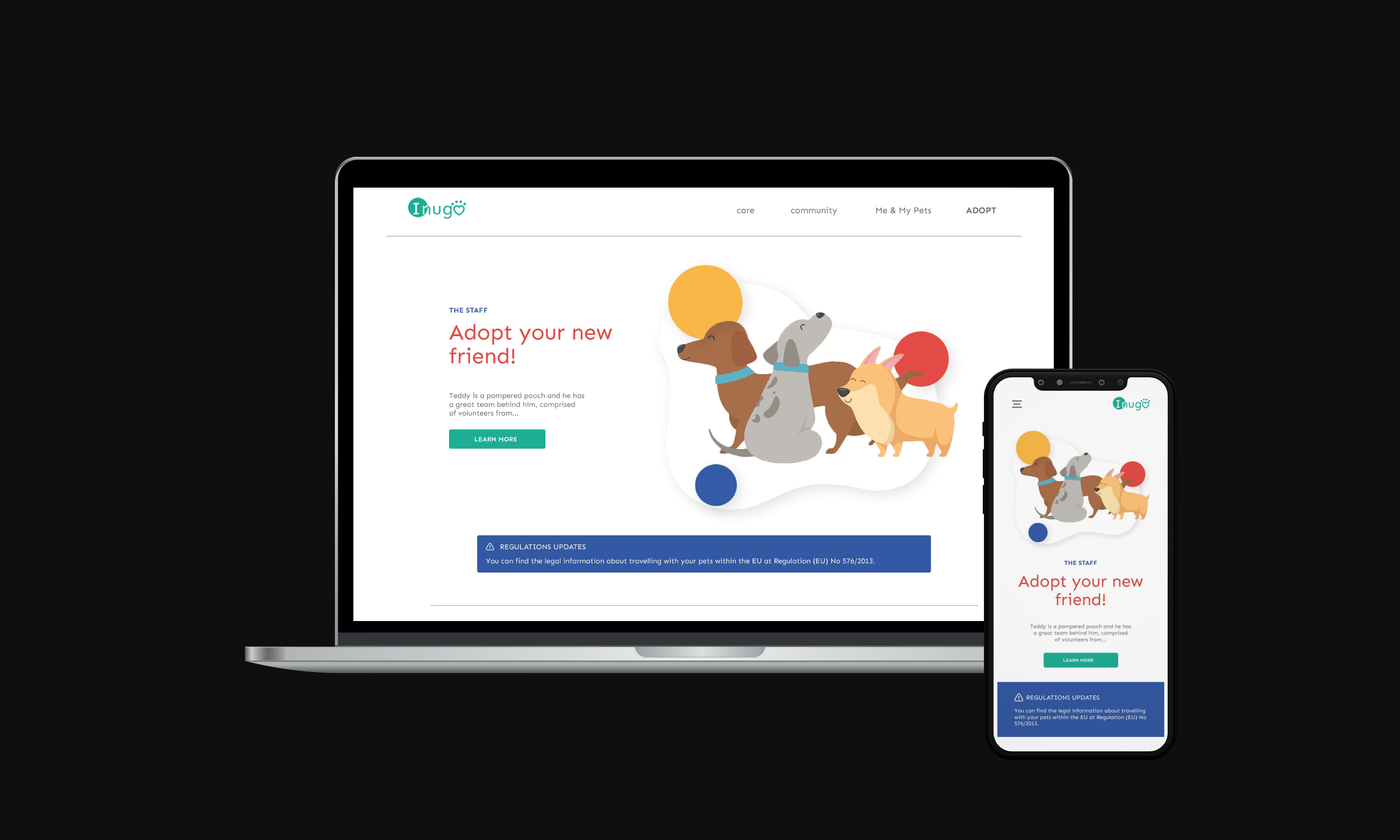
Inugo is a responsive website that revolves around pets, their health and meeting other pet loving owners.
The site allows users to keep track of their pets vaccinations and medications, updates users about health scares and pests in their area,
informs users about changes in regulations and allows them to be involved in the local pet-loving community. The website also connects users who want to adopt to the local shelters.
Role
UX designer, designing the app from conception to delivery
(mockups and prototypes developed in Adobe XD)
Responsabilities
Conducting interviews, paper and digital wireframing, low and high fidelity prototyping, conducting usability studies, accounting for accessibility and iterating on designs
Problem
People want to be informed about new regulations, local events and health scares / updates in their area without having to do research
Goal
Design an app that allows the users to keep their pets healthy and enjoy meeting other pet-loving people in their area

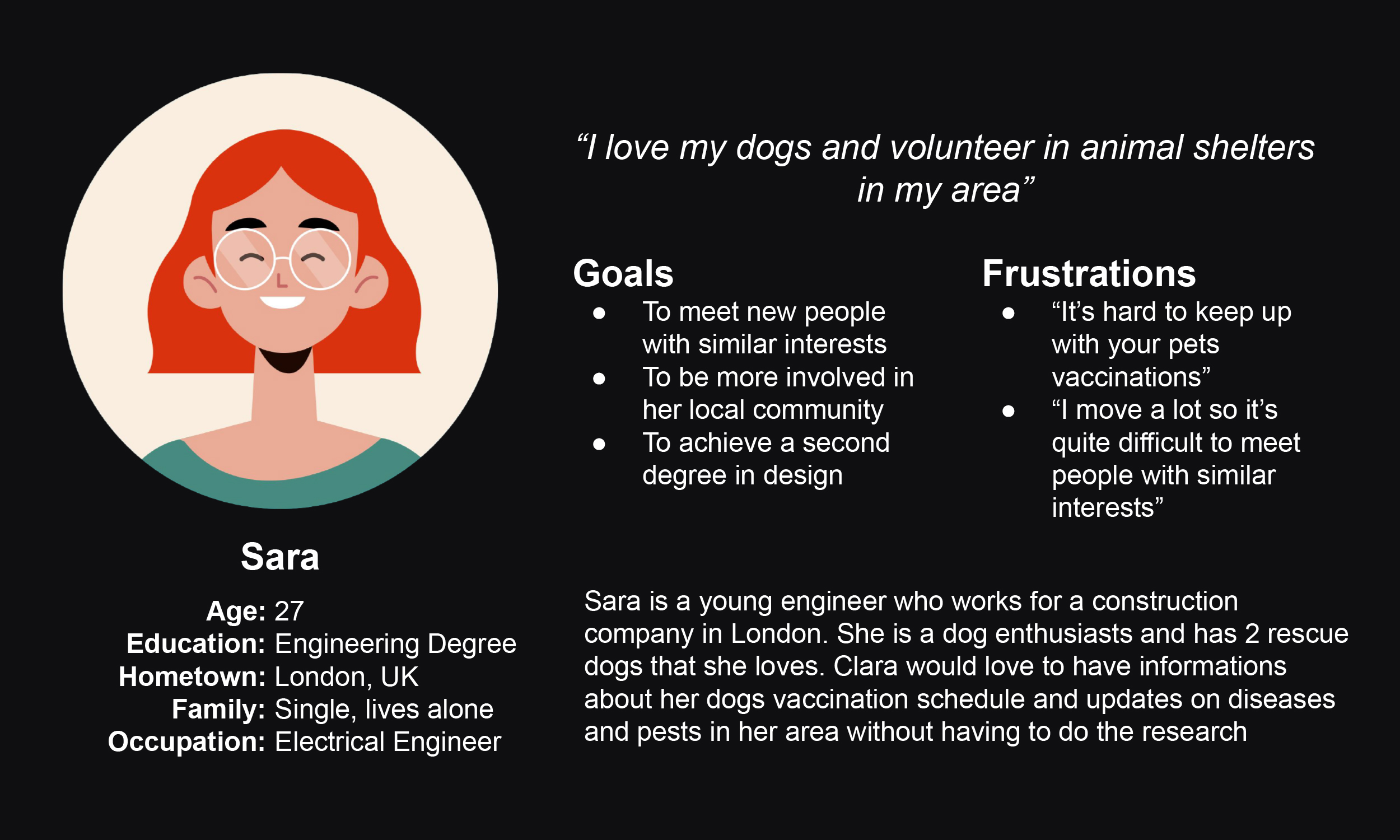

What can this Persona teach us about pain points?
I conducted interviews and created empathy maps to understand the users I’m designing for and their needs. A primary user group identified through research
was pet lovers that struggled to find informations about health scares and diseases
common in their area
Most of the people in the user group also preferred to have health related infos only in one place
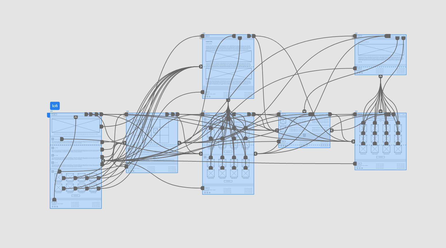
Paper Wireframes
Before moving into lofi and hifi prototypes, I wanted to get a feel of how the main user loops worked and quickly test changes to the design

Lofi prototype
After the wireframe the next step is developing a lofi prototype and use it for the usability study
Hifi prototype
After the first usability study some changes where made based on the insights, more specifically:
O Users struggled to edit the profile -> a modal was added;
O Users struggled to edit and add pets -> a secondary modal was added;
O Users struggled to know how to edit medications and vaccinations -> the page war reorganised to make the IA more understandable;
After this changes to the hifi prototype I conducted another usability study that resulted in only some minor tweaks
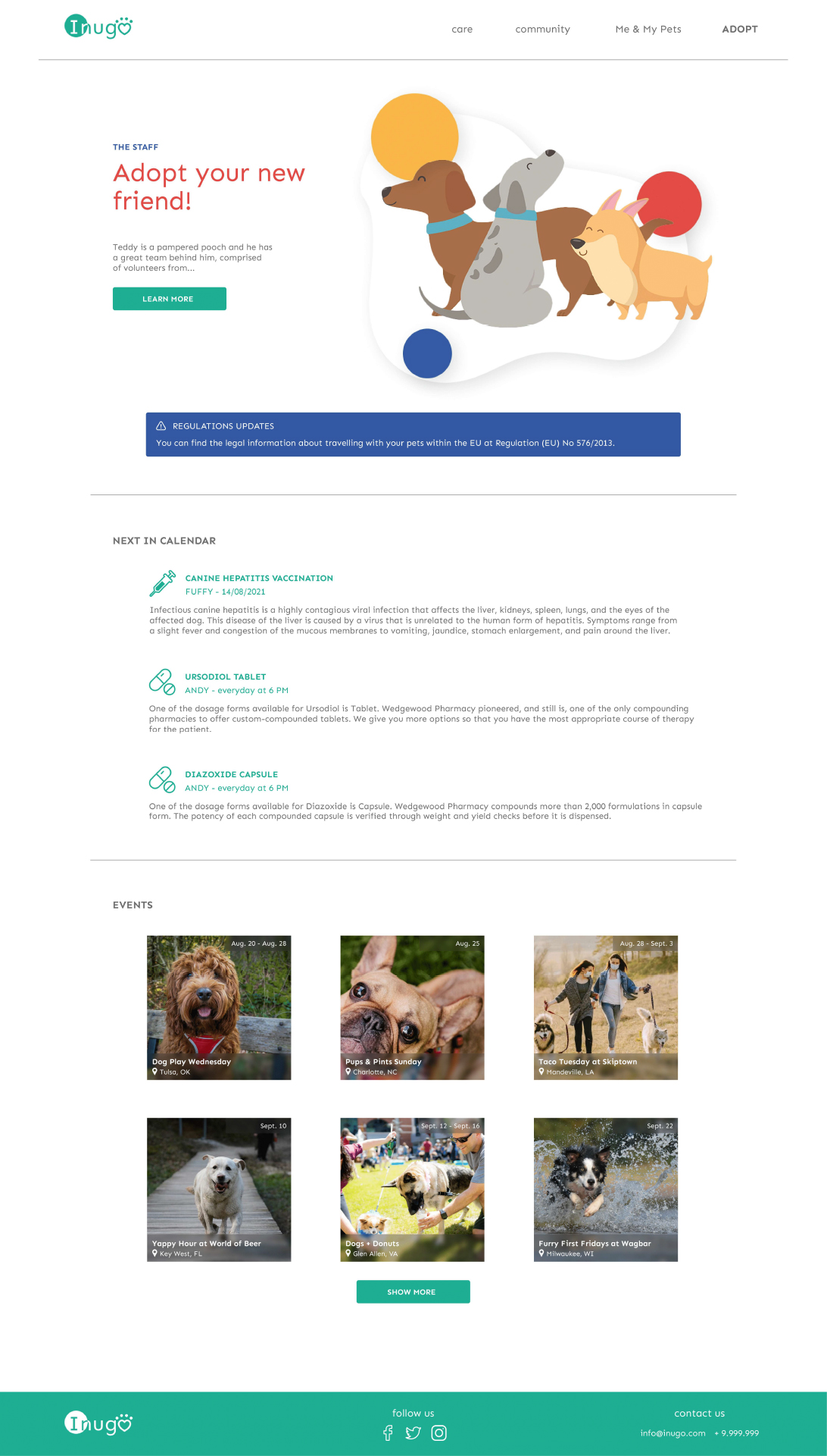
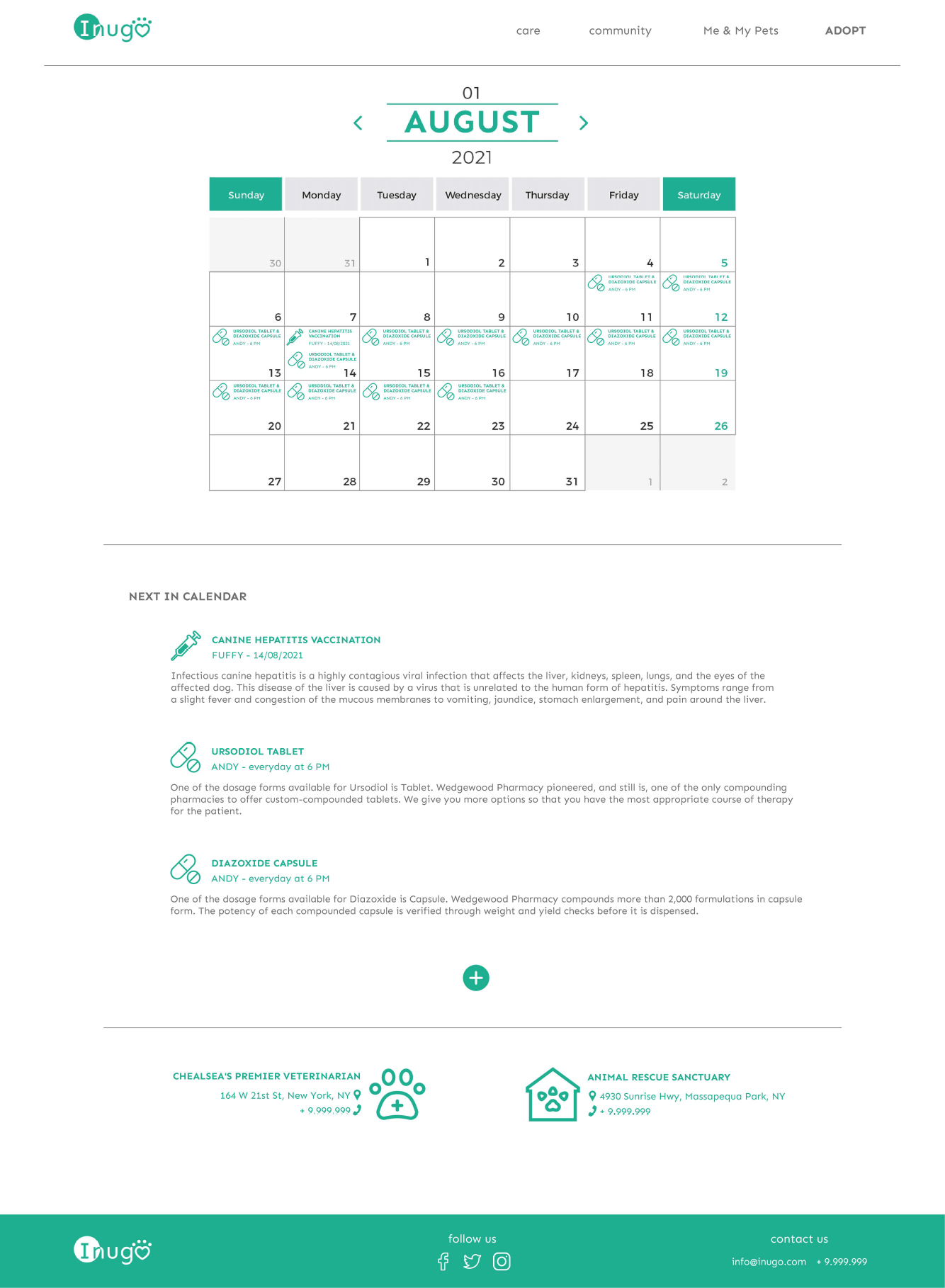
To highlight the health updates, infoboxes were colorcoded in blue and added at the top of the relevant pages
To improve the readability of the medications calendar (in particular for people with disabilities) the user can find the relevant infos not only in the calendar but also in a list format
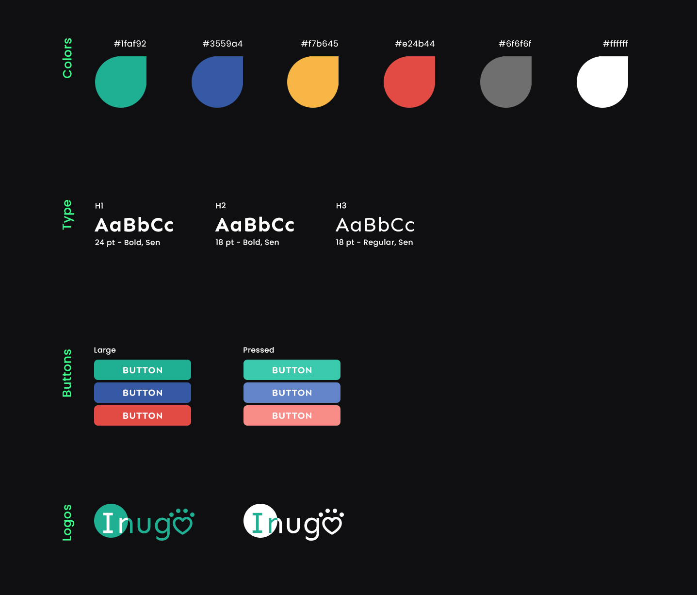
Style guide
Using different color for different meaning (blue for warnings, yellow for profile...) allows the user to easily navigate the content.
The main typeface of choice for the website is Sen, I felt this typeface best fit the app do to it's extreme versatility through uppercase and lowercase styling.