Inugo
Case Study
Inugo is a responsive website that revolves around pets, their health and meeting other pet loving owners. The site allows users to keep track of their pets vaccinations and medications, updates users about health scares and pests in their area, informs users about changes in regulations and allows them to be involved in the local pet-loving community. The website also connects users looking to adopt with local shelters.
Role
UX designer, designing the app from conception to delivery (mockups and prototypes developed in Adobe XD)
Responsabilities
Conducting interviews, paper and digital wireframing, low and high fidelity prototyping, conducting usability studies, accounting for accessibility and iterating on designs
Problem
People want to receive updates about new regulations, local events, and health concerns in their area without having to conduct research
Goal
Create an app that helps users maintain their pets' health while facilitating connections with other pet lovers in their community

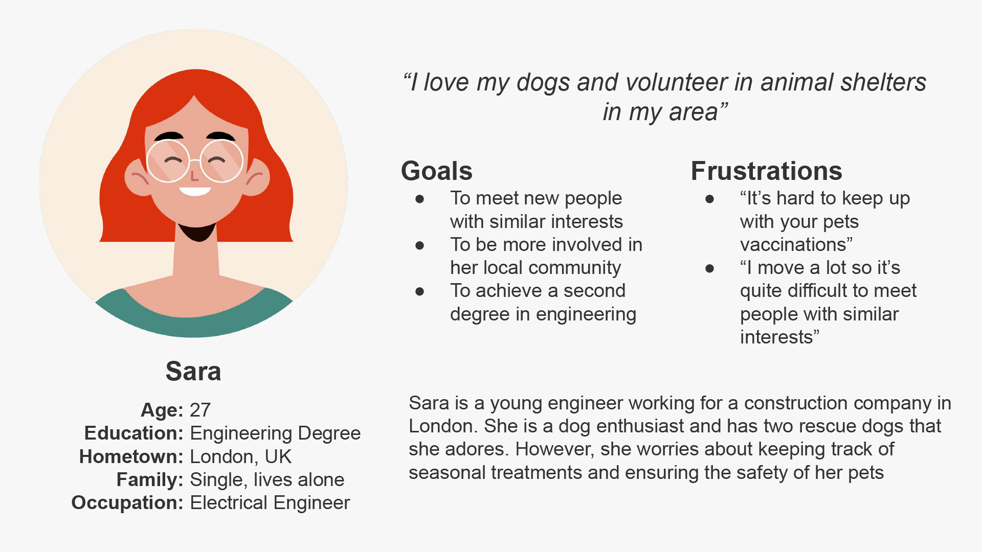

What can this Persona teach us about pain points?
I performed interviews and developed empathy maps to gain insights into the users I'm designing for and their needs. Through my research, I identified a key user group: pet lovers who face challenges in finding information about local health risks and common diseases affecting their pets.
Most of the people in the user group also preferred to have health related infos only in one place.
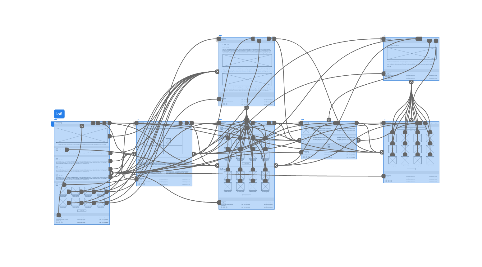
Paper Wireframes
Before transitioning to low-fidelity and high-fidelity prototypes, I aimed to understand the main user loops and quickly test design changes.

Lofi prototype
After creating the wireframe, the next step is to develop a low-fidelity prototype and use it for usability testing.
Hifi prototype
Following the initial usability study, several changes were made based on the insights gathered, specifically:
- Users had difficulty editing their profiles, so a step-by-step guided tutorial was introduced to assist them through the editing process;
- Users found it challenging to add and edit pets, leading to the implementation of an intuitive drag-and-drop feature for easier management of pet profiles;
- Users were uncertain about how to edit medications and vaccinations, prompting the addition of context-sensitive help tips and a clear visual hierarchy to enhance the navigation and understanding of the page;
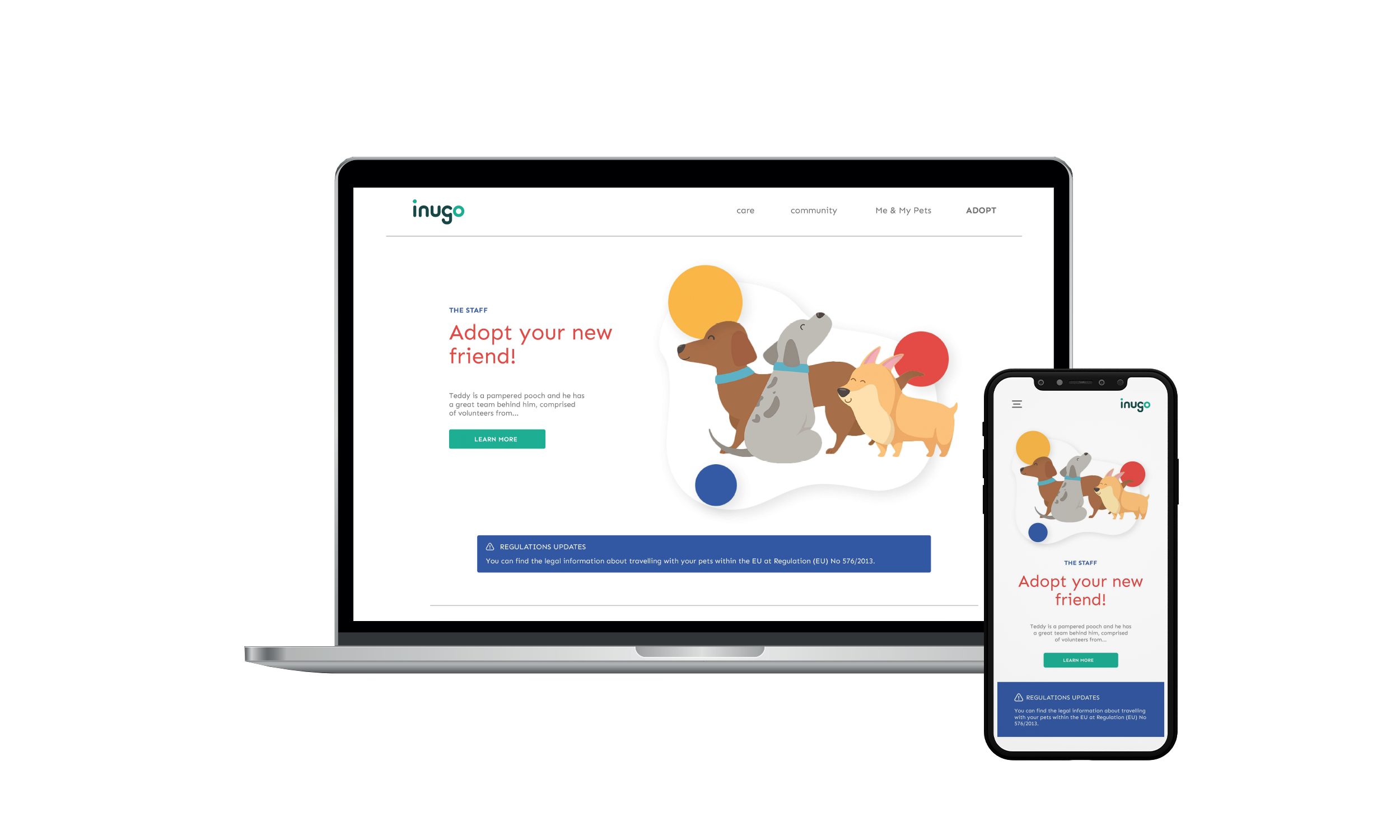
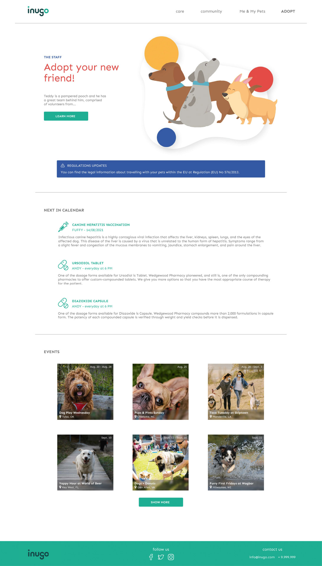
To highlight the health updates, infoboxes were colorcoded in blue and added at the top of the relevant pages
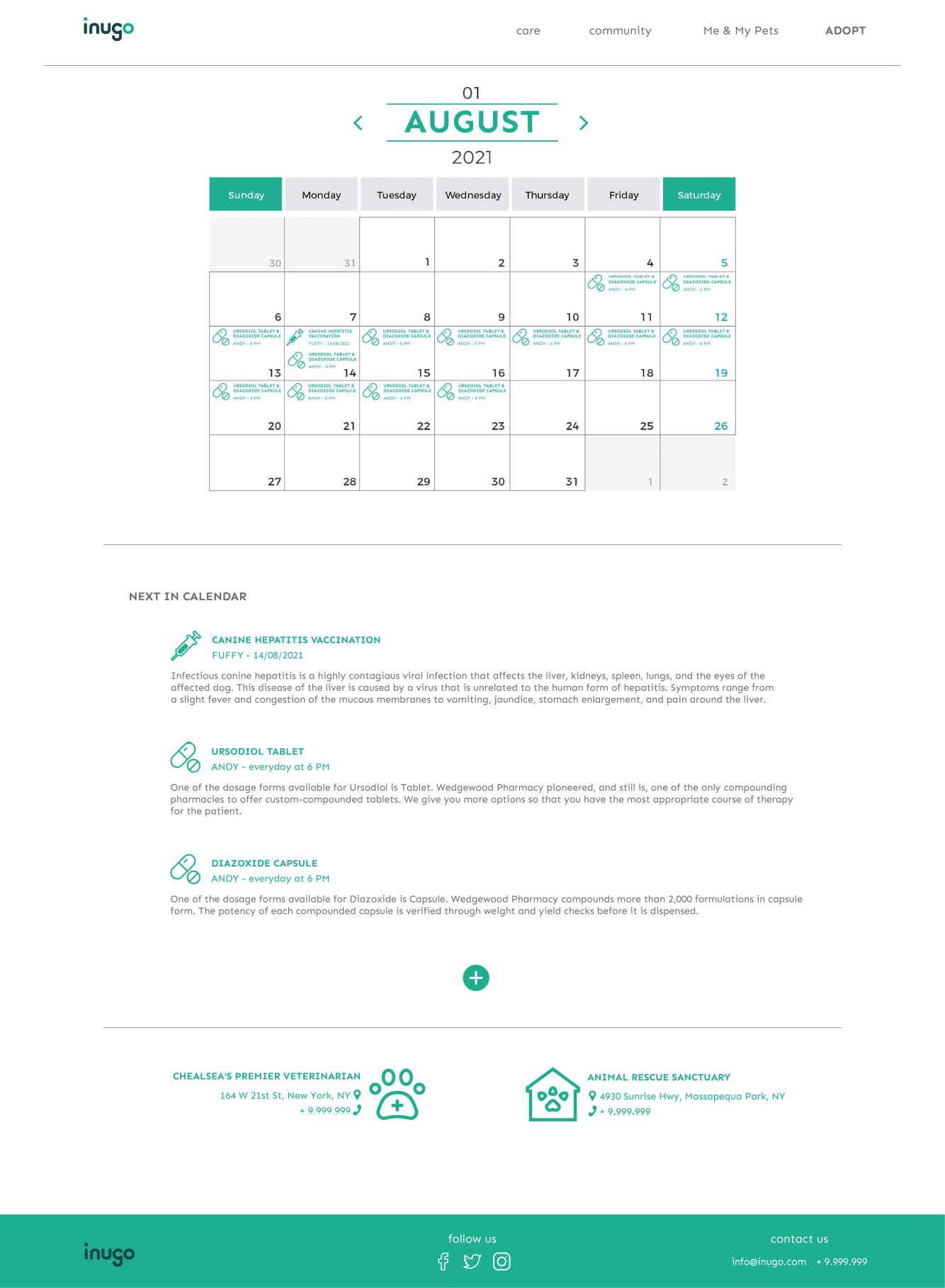
To enhance the readability of the medications calendar, especially for individuals with disabilities, users can access relevant information not only in the calendar but also in a list format
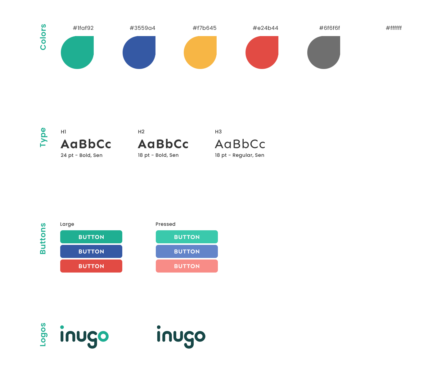
Style guide
Using different colors to convey distinct meanings (blue for warnings, yellow for profiles, etc.) allows users to navigate the content more easily. The primary typeface chosen for the website is Sen, as I believe this typeface best suits the app due to its extreme versatility in uppercase and lowercase styling.